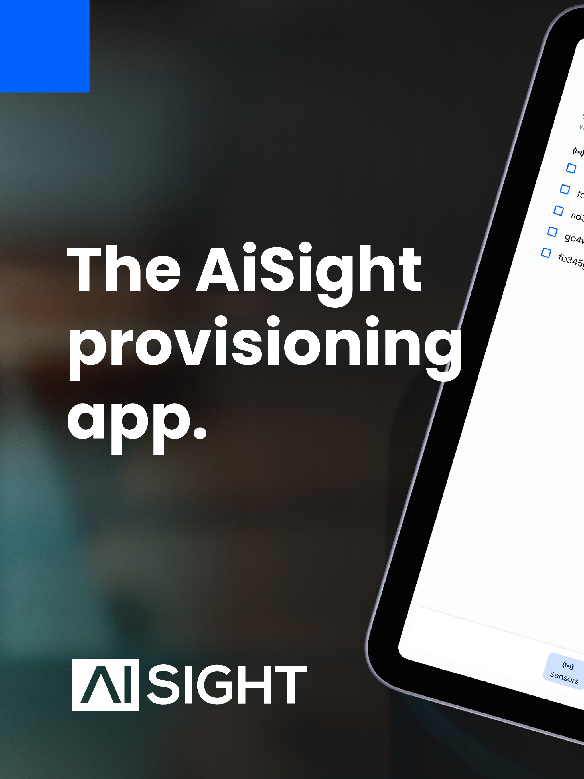
AIsight Blue Case Study
Delivering an IoT provisioning app in less than a month
-
Project
iOS app design
-
Stakeholders
UX/UI designer
Firmware engineer & front end developer
Product manager -
Timeline
1 month
Overview
In this project, our goal was to overhaul an existing provisioning app for sensor setup within industrial environments. The application had painful deficiencies, including sluggish provisioning times, a high error rate, and poor usability. As the UX/UI designer, my role involved collaborating closely with customers, management stakeholders and a dedicated firmware engineer to refine the app's functionality and elevate its usability standards.
Jump to the following sections:
V.1 AUDIT TECHNICAL RESEARCH REFINED SCOPE USER PERSONAS WIREFRAMES PROTOTYPE DESIGN SYSTEM USABILITY TESTING
THE PROBLEM
In industrial environments, the process of connecting sensors to the network can be a cumbersome and error-prone endeavour, often leading to frustration and inefficiency for the installation technicians. The existing app made it difficult, with slow setup times and unclear instructions, leading to errors, stress for installation teams and an underwhelming customer experience.
“How might we best support installation teams & customers trying to install sensors on their own?”
THE SOLUTION
Streamline the user flows and enhance the app’s functionality by adding three new features:
Batch provisioning: send credentials to multiple sensors at once
Save password: save network credentials securely
Network probe: measure wifi strength
TARGET METRICS
Success will be measurable through the following metrics:
Provisioning time for 1 sensor
Success rate (# of provisioned sensors / # credentials sent)
Connectivity issues (# of offline sensors)
Complaints to customer success
App downloads in the app store
DESIGN PROCESS
-

1. Understand
I audited the existing app to identify its key issues, and conducted lean user research to gather pain points & needs. Technical research helped us understand the limitations of the BLE protocol and iOS framework. These steps allowed me to refine the project scope, align stakeholders and prioritize features based on feasibility and impact.
-

2. Ideate
I created personas to segment users and guide our design, balancing internal technicians' and customers' needs. User flows were crafted to address all user needs, this ideation process was conducted in close collaboration with the developer to ensure feasibility.
-

3. Deliver
I developed wireframes and prototypes to validate the designs with users. Visual design was aligned with technical constraints and branding. Real-world testing at a factory validated our decisions and we released to the app store on time and budget.
1. Understand
AUDIT
For the audit of the original app, I meticulously examined its functionality and user interface. This process was essential to uncover fundamental shortcomings, including poor navigation, accessibility issues such as small font sizes and inadequate contrast, and overly technical language that hindered user comprehension. Ultimately, this audit provided valuable insights into the app's deficiencies, laying the groundwork for subsequent improvements to enhance usability and performance.
Lack of navigation structure
Not using brand’s design system: no coherence for customers and low accessibility
Overly technical UX writing
Missing essential functionality: password saving, provisioning multiple sensors at once etc…
Screens of the initial version of the app, created on Xcode.
BUSINESS OPPORTUNITY
Investing resources to enhance the provisioning app presented a significant business opportunity. The product manager had already recognized it as a bottleneck, causing slow installation times and additional costs. Customers' struggles with independent usage often necessitated sending installation teams, hindering scalability and incurring unnecessary expenses. Improving the app would streamline operations, empowering customers to handle installations autonomously, driving cost savings, and enhancing satisfaction. This move not only optimized efficiency for our teams but also expedited rollouts, strengthening our value proposition as a reliable partner capable of meeting evolving customer needs efficiently.
-

Installation trips lasted an average of 1.6 days when this project started, for an average of 40 sensors installed at a factory. Reducing the duration overall cost of the installation trip was one of our business goals.
-

Once our solution had been piloted for a few months on a production line, customers would usually roll it out throughout the factory, installing up to 200 sensors. Installation speed was crucial for scalability.
-
On average, installation trips incurred costs of around €2000, including transport, technicians’ time and accommodation. Speeding up installations could mean avoiding overnight stays and drastically reducing these costs.
USER INTERVIEWS
The initial user interviews conducted by the product manager with installation teams and customer success managers were somewhat limited in scope and lacked detailed transcripts. The product manager preferred not to bother these users again, so I was unable to conduct additional interviews myself. To compensate, I focused on extensive testing later in the process to fill any potential gaps in information. Although I typically like to define my research goals, write scripts and conduct user interviews personally, the expedited timeline of this project required flexibility and adaptation in my methodology.
“It takes as much time to provision as to mount the sensors!”
User interview notes
User journeys for mounting, documenting and provisioning sensors.
TECHNICAL RESEARCH
To ensure seamless integration of the user experience improvements with the technical infrastructure, I engaged in extensive technical research with our firmware engineers. By discussing and reviewing their documentation, I gained insights into the communication between our sensors, our cloud, and the iOS app. Despite uncovering some serious limitations, this collaboration provided valuable insights into the technical intricacies. By understanding these constraints, I identified opportunities to streamline the user experience effectively while ensuring alignment between design decisions and technical feasibility. This research phase was instrumental in proposing enhancements that were both feasible and impactful.
Mapping the various firmware processes to understand capacities and limitations.
REFINED SCOPE
After completing the initial research, it was crucial to align all stakeholders on the project's scope. Given the technical nature of the provisioning app and varying levels of technical understanding among stakeholders, I wrote detailed requirements and user stories to ensure everyone was on the same page. This was particularly important because our hardware engineer would also be developing the front end of the app. Although Sam had limited front-end experience, he was eager to learn and had already coded the first version of the app. Given our tight timeline and limited resources, working with him was more efficient than waiting for a more experienced developer to become available.
Our product manager was very resource-conscious and aimed to deliver maximum value for the project, which sometimes led to scope creep. He requested additional features and enhancements without always understanding the technical effort required. His drive to maximize value was well-intentioned but occasionally led to unrealistic expectations about what could be achieved within the given timeframe and resource constraints. This made it essential for me to meticulously detail the requirements to manage expectations, avoid scope creep, and ensure we prioritized features based on feasibility, effort, and impact. While I might typically take a more agile approach, in this case, thorough documentation was necessary to manage these challenges effectively.
Requirements & user stories documentation
CORE FEATURES
2. Define
USER PERSONAS
To ensure our design decisions met the diverse needs of our target audience, I developed detailed personas representing the two main types of users: internal installation technicians and customer electricians. This process was crucial for segmenting our user base and understanding where their needs and pain points intersected and diverged. By clarifying these aspects, I was able to build consensus among stakeholders, especially when facing critical design decisions. Striking a balance between the efficiency-driven requirements of our technicians and the ease-of-use needs of customer electricians proved to be a delicate but essential undertaking in delivering a well-rounded user experience.
Alex, 28, Installation technician
Alex works as a field technician for AiSight, a company that sells sensors for industrial monitoring. His role involves visiting different factories every week, to install sensors and ensure their proper functioning. He has technical expertise in network provisioning and troubleshooting.
Philipp, 42, Facility electrician
Philipp is a facility electrician working in a large factory using the AiSight solution. He has basic digital proficiency and is responsible for installing additional sensors independently. He does not have previous experience with network provisioning and needs a user-friendly app to complete his tasks efficiently.
3. Ideate
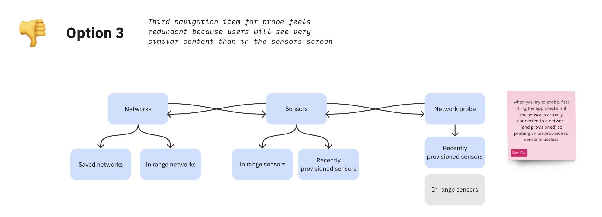
INFORMATION ARCHITECTURE
I studied various information architecture schemes to determine the best way to structure the app. I needed to balance the needs of AiSight technicians, who would use the app frequently and prefer to jump straight into tasks, against customer users who would open the app rarely and require more guidance. After careful consideration, I advocated for an architecture that prioritized the needs of the more frequent users. I decided to add a bit more hand-holding and clearer explanations in the loading screens and help sections, to ensure a more intuitive experience for all users, while still keeping the architecture streamlined enough for regular users.
USER FLOWS
I then created user flows to ensure that all user needs were thoroughly addressed in the designs. By conducting task analysis and mapping out the flows, I aimed to capture every step our users would take during the provisioning process. However, this stage also uncovered new limitations of the firmware that our firmware engineer had not anticipated. Despite these challenges, through iterative back-and-forth discussions and adjustments, we managed to land on practical design decisions that balanced functionality with the technical constraints.
3. Deliver
WIREFRAMING & PROTOTYPING
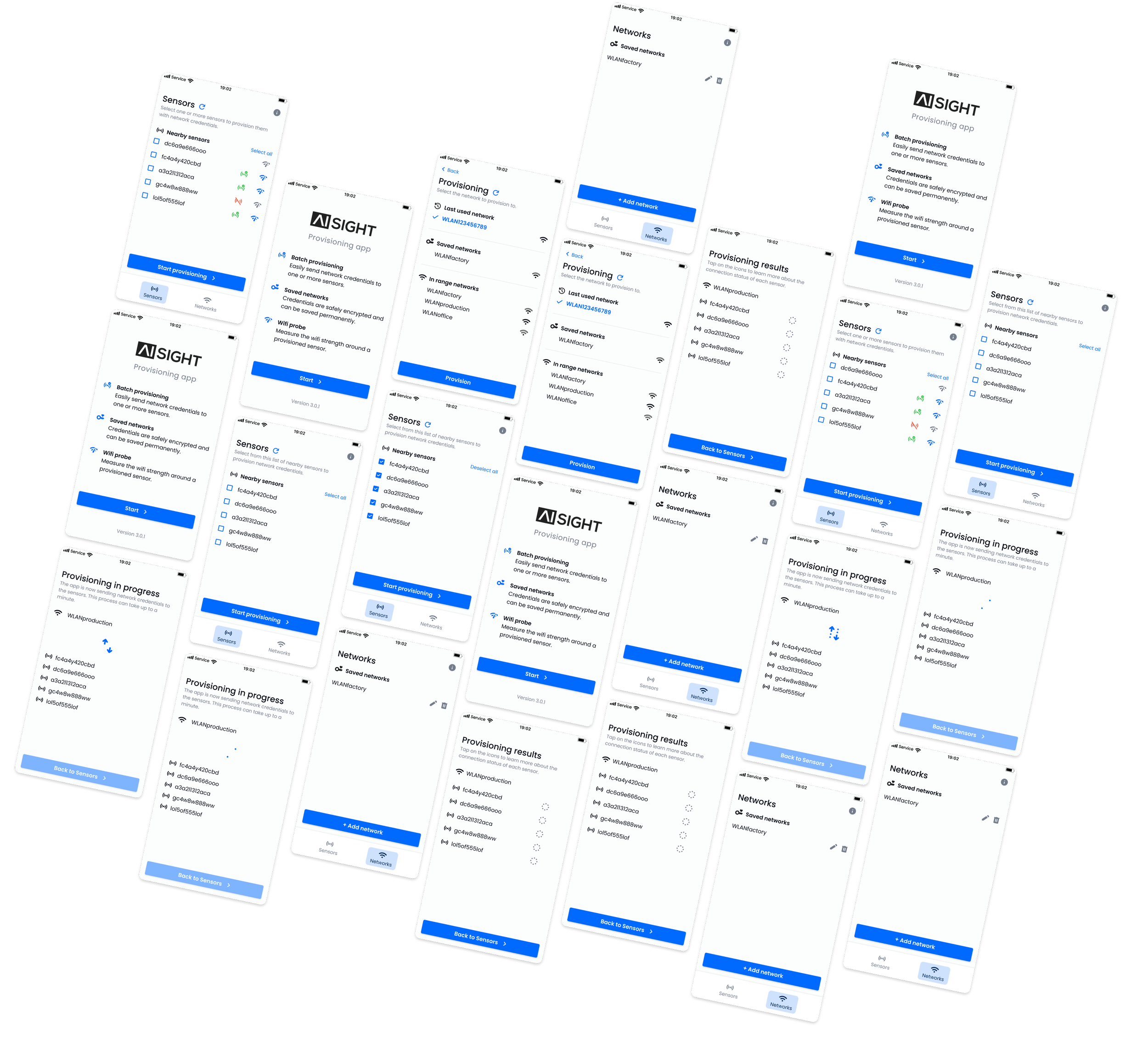
During the prototyping phase, I focused on creating low fidelity wireframes to quickly validate our design decisions. This approach allowed us to collaborate effectively on the front-end development. We embraced agility by showing these prototypes to internal users, which helped us gather immediate feedback and make necessary adjustments swiftly. Throughout this process, we used Miro, a collaborative whiteboard tool, and the commenting function on Figma to leave comments on designs and keep the product manager and other management stakeholders in the loop. We needed to iterate rapidly while keeping stakeholders informed of the evolving design decisions and ensuring that these iterations did not impede our tight development timeline. Balancing speed and quality was crucial to keep the project on track and meet our objectives within the limited timeframe.
DESIGN SYSTEM
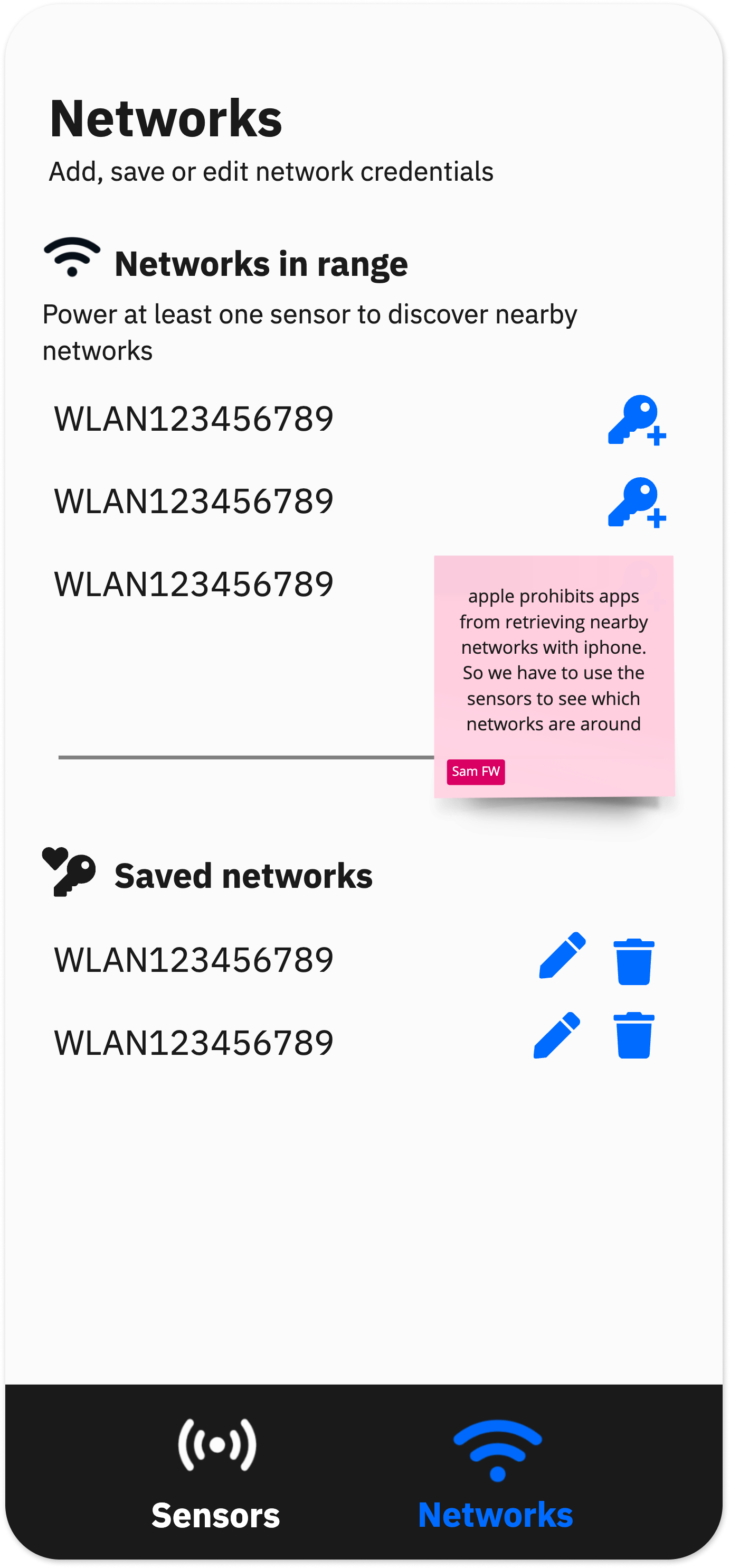
For the UI, I utilized the existing design system that I had already developed for our main dashboard, which allowed me to move quickly. However, since the tech stack was different, we had to replicate it visually in Xcode, and some elements could not be perfectly matched. One of the main goals was to make the app feel more consistent with our brand, ensuring it looked and felt like an integral part of our product.
To make the app feel more iOS native and streamline development, I decided to use the native iOS bottom navigation bar, even though our web app features a side navigation panel, hidden behind a hamburger menu on mobile. Initially, I was a bit concerned due to Sam's limited front-end experience, but he was very eager to learn about UI design. He paid close attention to details like padding and alignments, which was crucial for maintaining our brand's visual consistency.
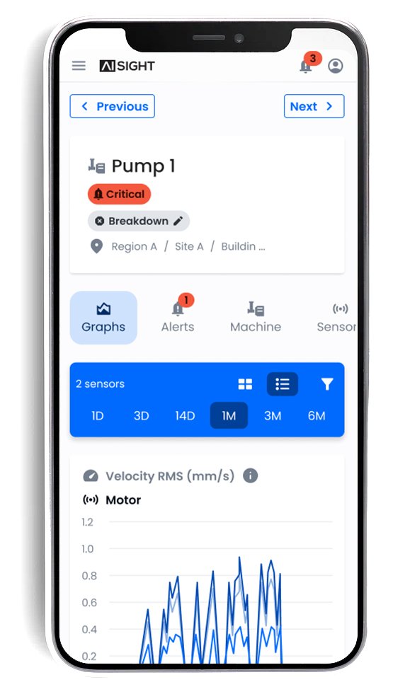
UI of the main dashboard
INTERACTIVE PROTOTYPE
USABILITY TESTING
As soon as I had a clickable prototype, I ran in-person usability sessions with seven internal users. I tested all interactions, focusing the script on addressing previous pain points and evaluating the clarity of the explanations. I would usually collaborate with a UX writer, but for speed, I wrote all the instructions myself and had our marketing copywriter check them for grammar and brand voice. During testing, many comments focused on these instructions; customer success testers were particularly helpful in fine tuning each word to ensure their customers would understand them easily.
While it may not be the most formal UX methodology, I tweaked the prototype between sessions when obvious usability issues arose, aiming for speed and efficiency over dogma. Some of the quick fixes included adjusting custom icons for clarity, resizing elements, or adding some necessary functionality like a ‘select all’ button.
Usability testing script and results
Usability testing: results analysis and iterations tracking

IN SITU TESTING
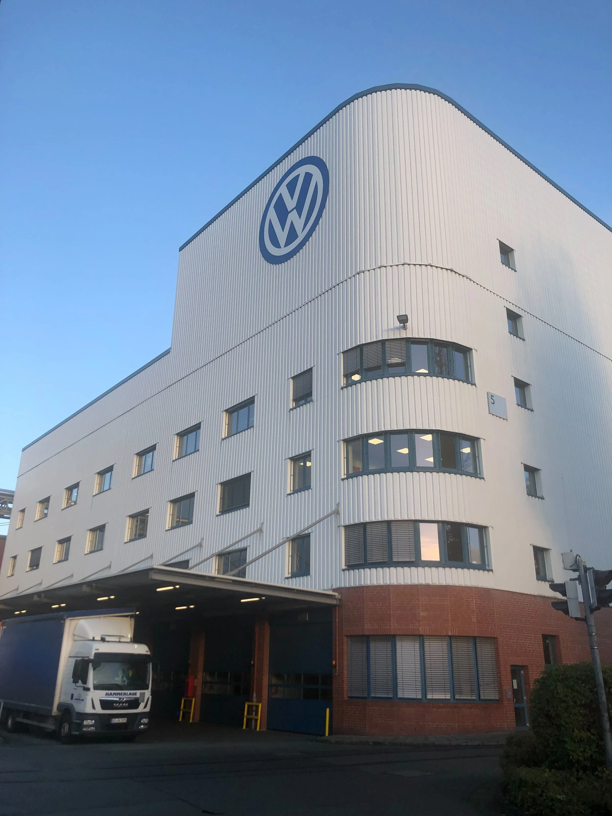
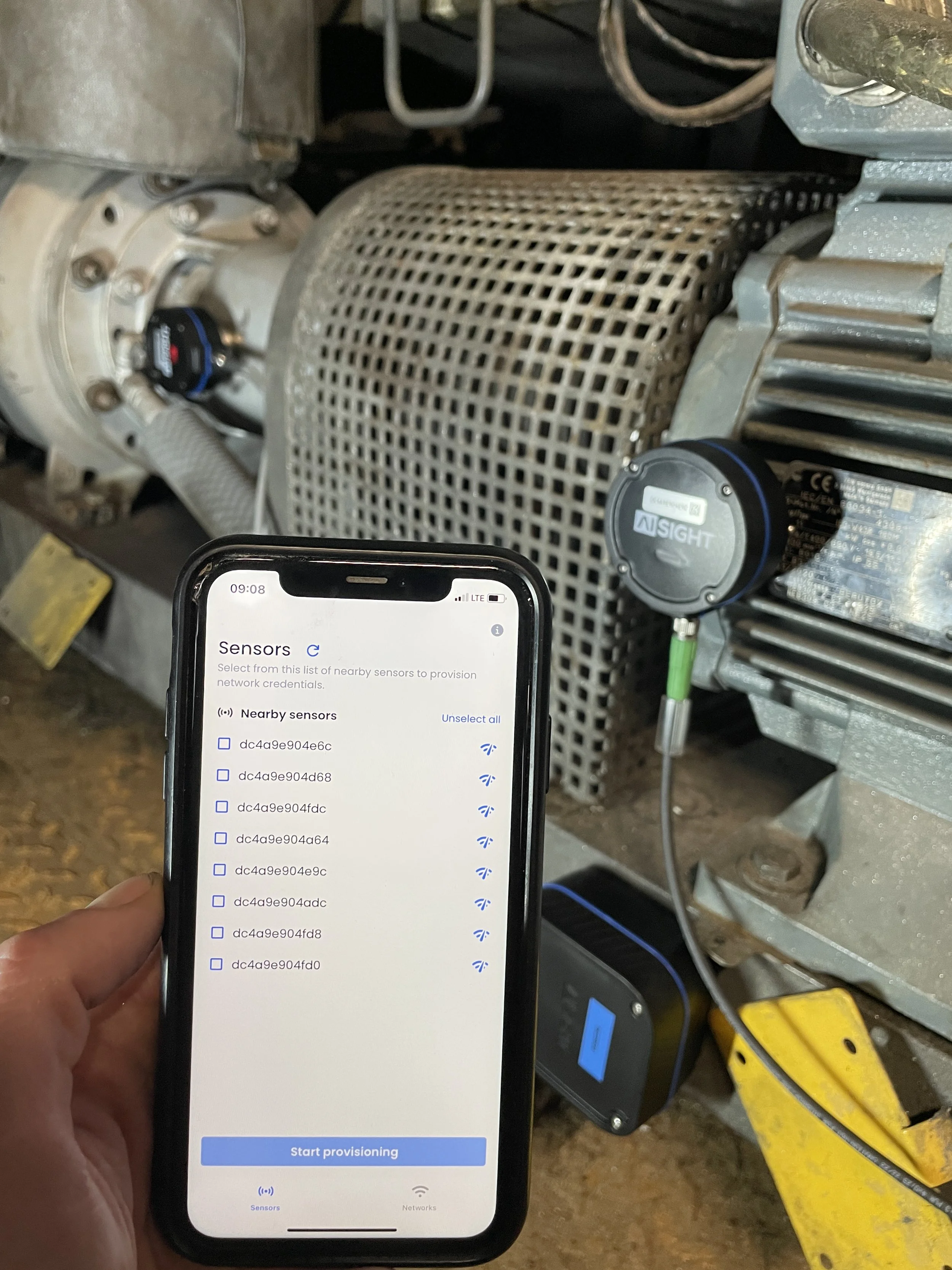
After developing the app, I still wanted to test it in an industrial environment before making it available to customers. We chose the Volkswagen Osnabrück factory, known for its connectivity challenges with thick concrete walls, numerous metallic surfaces, and potential electronic interferences. Additionally, we had to re-provision already installed sensors, some of which hard to access, and install new sensors, making it the perfect use case to test our app.
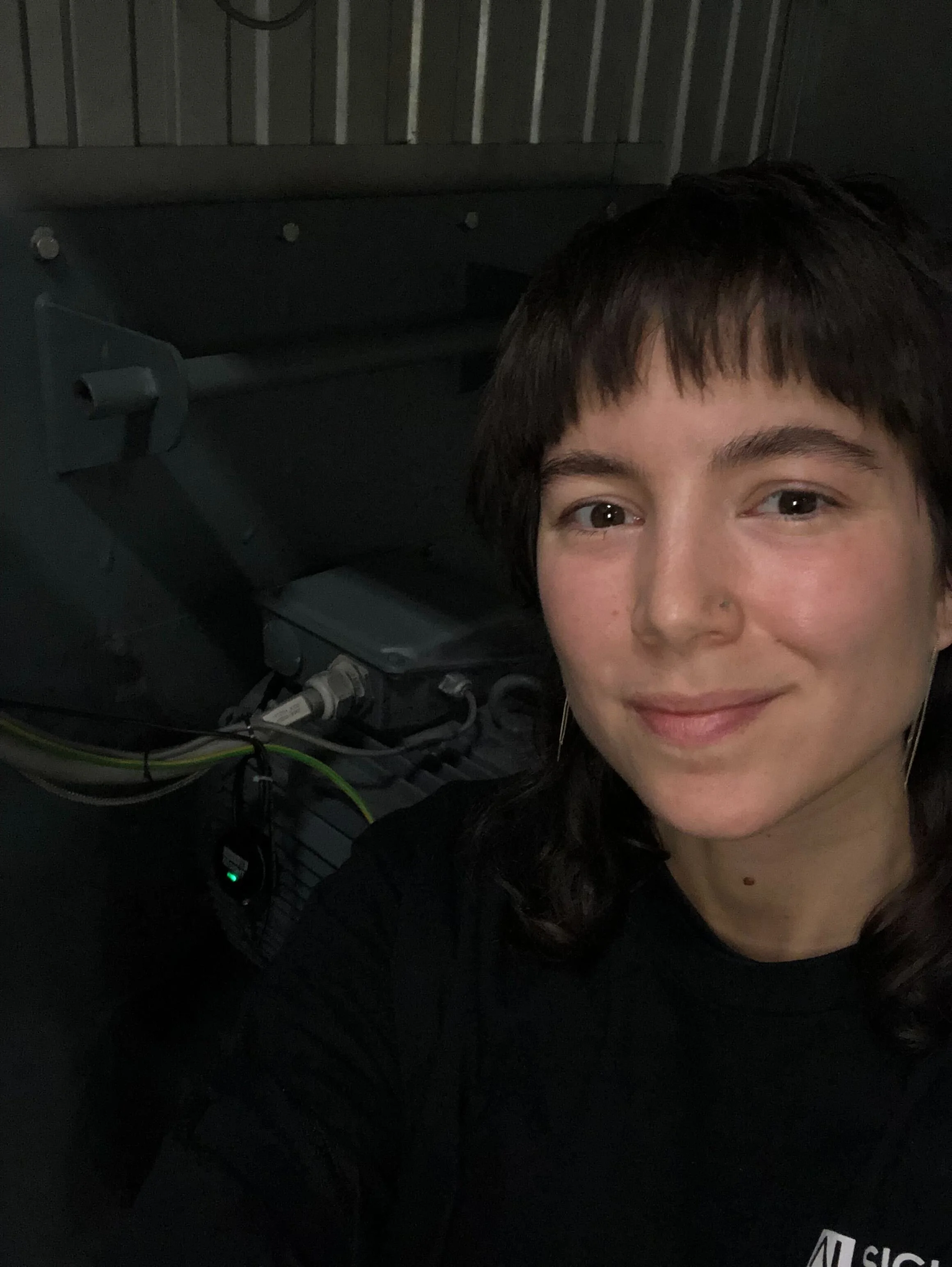
Even in these challenging situations, the app performed exceptionally well, reducing provisioning times from 5 minutes to a maximum of 30 seconds, an efficiency increase of 90%! Some of the sensors were in dark, loud and high vibration areas, accessible by ladders, and the simplified UI made it easy to provision with one hand only. The only drawback was that the connection status confirmations implemented with the existing firmware were insufficient for a clear overview of which sensors were provisioned. I took notes of these limitations for future iterations of the app.
MEASURING THE IMPACT
To measure the impact of the provisioning app redesign, I timed tasks and tracked error rates for 20 sensors during an installation at a factory. I also sent a brief survey to our installation teams a month after the initial release in order to track satisfaction and capture feedback and future improvements.
-

Satisfaction
Post-redesign, technicians reported a solid 7.4 out of 10 NPS indicating a positive reception, although the respondents were internal users involved in the app’s development, which may introduce some bias.
-

Performance
The redesign improved provisioning speed by 90%. The new password-saving feature alone saved roughly 15 seconds per sensor, streamlining the overall process and making installations faster.
-

Error rates
Error rates saw a notable reduction. While initially there were 4 errors out of 20 sensors, all were resolved on the second provisioning attempt. Technicians reported a drastic reduction in provisioning and password errors.
APP STORE RELEASE
Once we were confident in the solution we had built, the last step was to promote it to our user base. I worked with our marketing designers and copywriter to create compelling app store visuals and copy. We focused on clearly communicating the benefits of the revamped app, showcasing its improved user experience, and highlighting its new features. This collaboration ensured our app store presentation was both visually appealing and informative.
Summary
EVALUATION
The main challenge of this project was to overhaul an existing app that was slow, error-prone, and difficult to use. By collaborating closely with my stakeholders and applying user centric design methodology, I was able to redesign the app to significantly improve its usability and performance within a month. The redesigned iOS app now has additional features, improved usability, and is more visually aligned with our brand. These improvements resulted in a 90% increase in provisioning speed, a significant reduction in errors, and improved qualitative rating from core users.
KEY LEARNINGS
Because this project was a side initiative, it was easy to be strict with resources and assign limited time and personnel. This clear definition of goals and timeline made the project particularly satisfying to tackle. Working with Sam, a precise firmware developer eager to learn front-end development, was especially rewarding. I enjoyed mentoring and sharing knowledge about UX principles and UI elements with him. While it would have been preferable to conduct my own interviews and have more thorough user research, this project highlighted the need to be flexible and adapt methodologies to specific situations. Additionally, testing in the field underscored the importance of real-world validation, revealing insights such as the need for users to complete tasks with one hand in vibrating environments—something our design thankfully accommodated well.
NEXT STEPS
Moving forward, we plan to closely monitor the adoption and performance of the redesigned app through continuous feedback from users and detailed analytics. One main feature request is to improve the visibility of task progression when provisioning a large number of sensors. Our new design gives feedback on recently provisioned sensors but does not show an overall view of all installed sensors (old and new) and their connection status. We could address this by adding a QR code scanner or a text search field to input specific sensor IDs and fetch their connection status. However, we probably will not invest too many resources in future versions of this app because many customers are actually requesting an Android version. It would make more sense to include the provisioning flows as part of our main web app to avoid maintaining two additional apps.
