
-
Client
Bündnis Selbstbestimmung Selbst Gemacht (SBSG)
-
Roles
Art Director
Graphic Designer
Web Designer -
Deliverables
Branding Workshops
Brand Book & design system
Website & Instagram
Stationery & promotional items
Conference program & materials -
Timeline
6 Weeks
Overview
I got to know the Bündnis Selbstbestimmung Selbst Gemacht (Self-determination Self-made - SBSG), a self-organised group of politically engaged trans* and non-binary people, in the lead-up to their first big event: the national conference Queerokratia.
In under 6 weeks, I collaborated with several core members of the organisation, developing for them a coherent yet impactful visual brand to fit their rebellious energy while appealing to the more conservative stakeholders they worked with. I designed a wide array of digital and printed assets and helped establish them as a trustworthy player on the trans international scene and ensure the conference was a success.
Branding Concept
I surveyed the existing leading trans political groups in Germany and international, to identify trends and potential visual differentiators. I also led several branding workshops with team members, in order to achieve a common understanding of the exact positioning of the group in terms of style & voice. We tweaked all the brand parameters until the right balance of DIY to Corporate was achieved.
-
![Design process diagram]()
Align.
We were working on a tight timeline until the conference, I ensured all team members were aware of my process and what would be needed from them in order to meet the challenging deadline.
-
![]()
Listen.
I conducted several intake discussions with core members in order to make sure all voices of the group felt heard. This intake allowed me to define a common vocabulary for the brand.
-
![]()
Audit.
I audited the existing communications of the group in order to build a common definition of what a successful rebranding needed to achieve.
-
![Branding diagram, positioning of SBSG.]()
Position.
We framed the problem by identifying where the group felt they stood compared to other Berlin collectives or brands, and where they wanted to get to. Their main goal was to appear more trustworthy and legitimate, while keeping their activist spirit.


Inspiration
With our goal defined (building trust with a more conservative audience while maintaining the group’s activist energy) I got started on visual design and gathered a range of inspiration images, looking to solve several key challenges:
The group had limited access to high-quality visuals and often needed to promote events before capturing engaging photos. I needed to find ways to work with low quality or stock images.
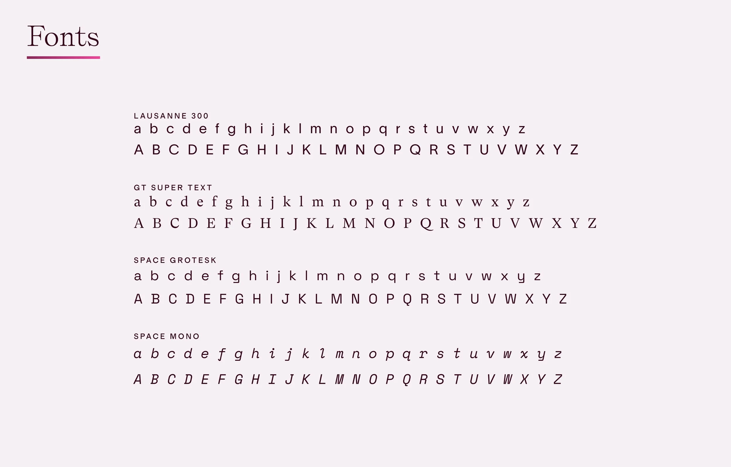
SBSG’s communications leaned heavily on longer, more discursive text, so I prioritized choosing fonts and layouts that were comfortable for reading lengthy bodies of text, while staying appealing on social media.
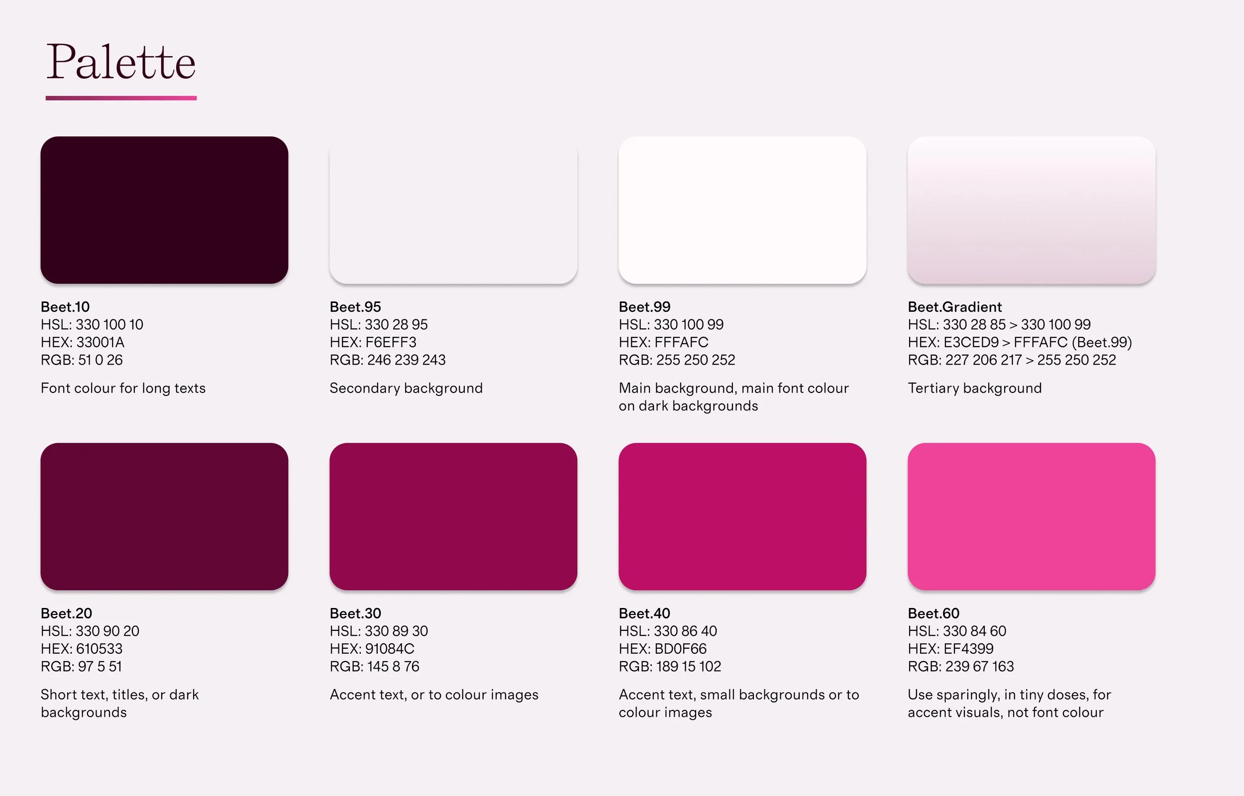
The design also had to appeal to a trans audience while standing out from other activist organizations, for this I looked to original colour palettes.
-
![Design process diagram]()
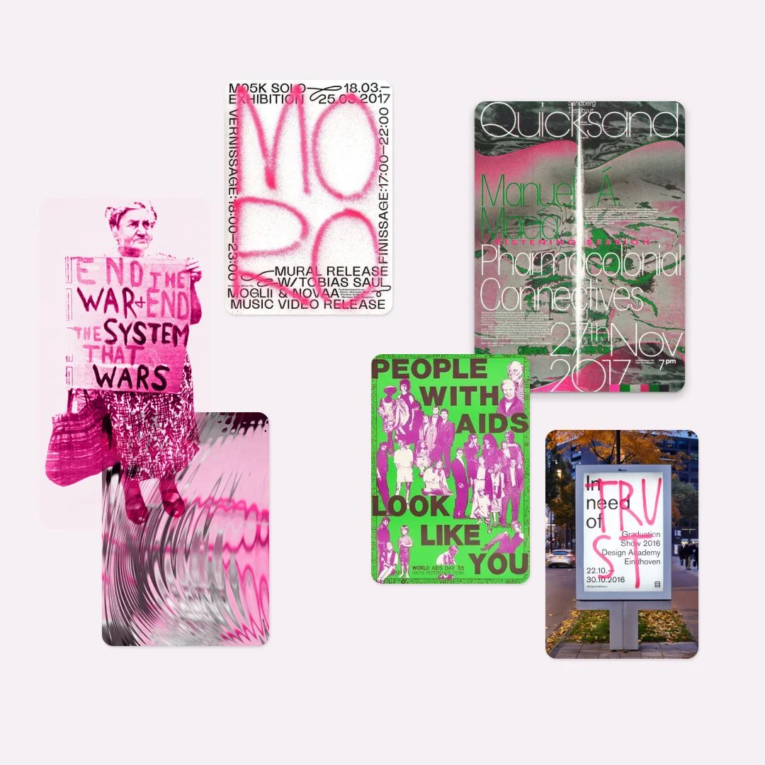
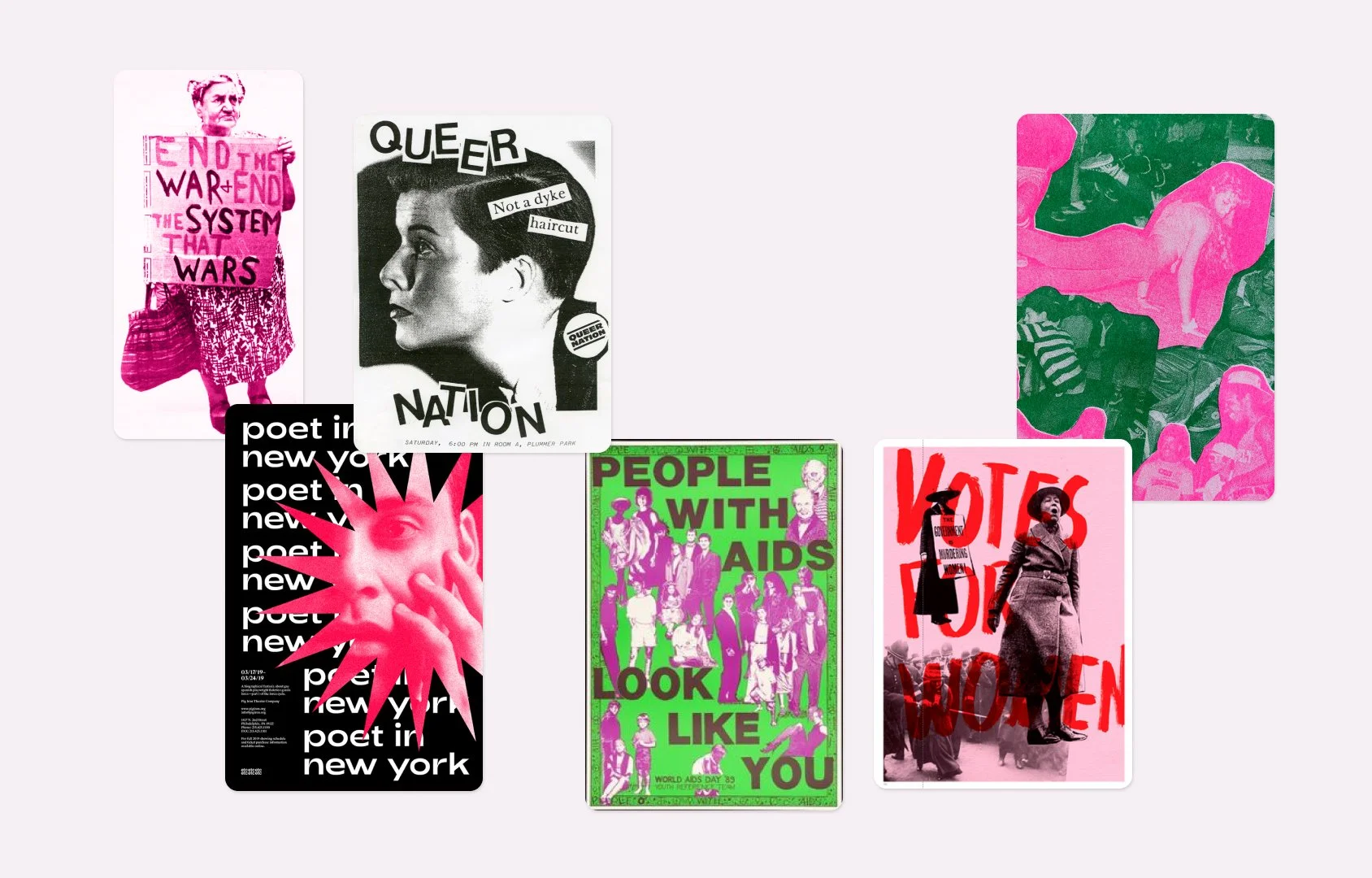
Zine imagery.
Drawing inspiration from DIY zines as a creative solution for using low-res event photos. The zine/riso texture gives a DIY, grassroots feel, while mono or bichrome designs ensure the overall identity stays cohesive and visually sharp.
-
![Moodboard: inspiration images for branding redesign]()
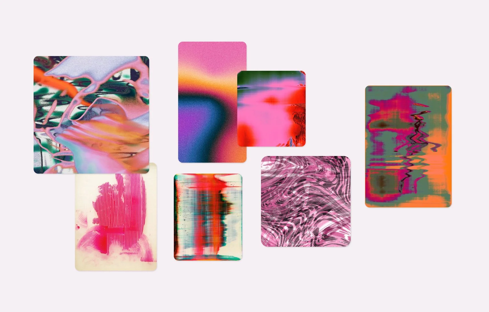
Textured backgrounds.
I researched using scanner and photocopy textures, abstract visuals to bring more expressiveness to social media backgrounds. Monochrome or bichrome color schemes keep the identity cohesive and recognizable, without overwhelming the messaging.
-
![Moodboard: inspiration images for branding redesign]()
Grotesque fonts.
I looked towards early sans serifs fonts to bring a sense of modernism with a touch of quirk, less polished but full of character. Their wider set improves legibility, making them ideal for digital content, while also pairing well with serifs for longer printed materials to maintain readability and style cohesion.
-
![Moodboard: inspiration images for branding redesign]()
Editorial layouts.
I looked to editorial layouts to handle both short and long-form content effectively. For shorter pieces, collage-style backgrounds could add a dynamic, creative edge. Longer texts could be structured into narrow columns, taking inspiration from editorial design and museum exhibition books, giving a curated, yet easy to read feel.


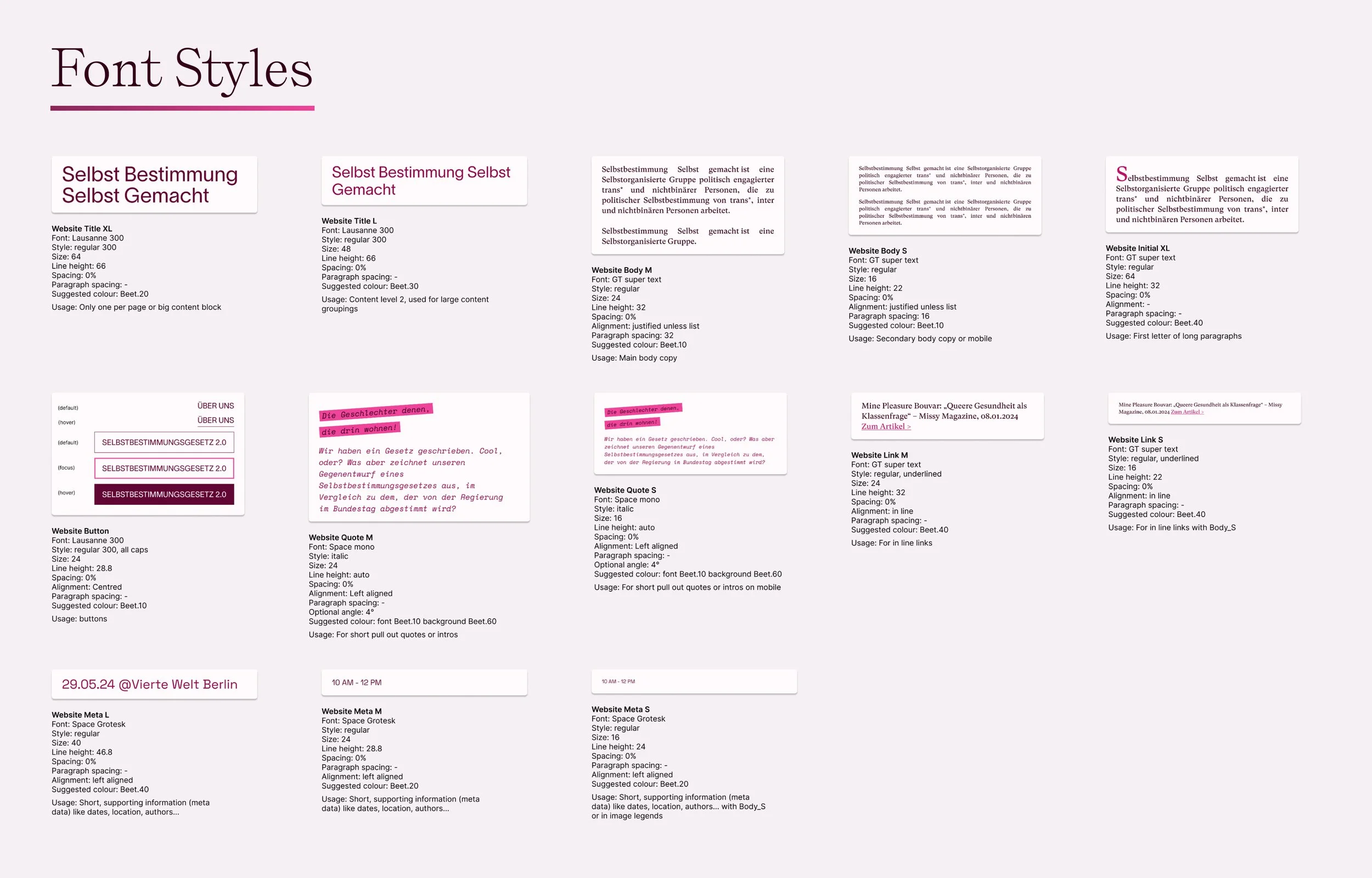
Deliverables
This project involved a large amount of digital and printed deliverables, all due before the start of the conference. I delivered a full brand book, logo design, website (in collaboration with a developer), social media templates, and printed collaterals in under 6 weeks. Additional deliverables included a grant application dossier, podcast cover design, party merchandise (t-shirts, visors), and a custom stamp for the party. I also created signage for both the party and conference spaces.
To manage the workload, I had to prioritize ruthlessly and communicate my process clearly to the team. A challenge was navigating the collective's self-organized, anarchist structure—ensuring everyone felt heard and represented while still pushing forward with clear approvals. Unfortunately some of the merch didn’t arrive on time (sigh - no party visors…), but otherwise, the feedback from the conference participants was overwhelmingly positive.

Some of the printed collaterals designed for the conference
Logo design
The group’s long name posed a challenge for logotype design, so I opted for using the full name in a clean, readable font, while spray-painting the initials over it. I drew inspiration from a mix of street art and institutional aesthetics. I explored the idea of combining grotesque fonts with spray paint overlays, where the spray would overlap & blend with the typeface.

Research photos of graffiti, Berlin, 2024.
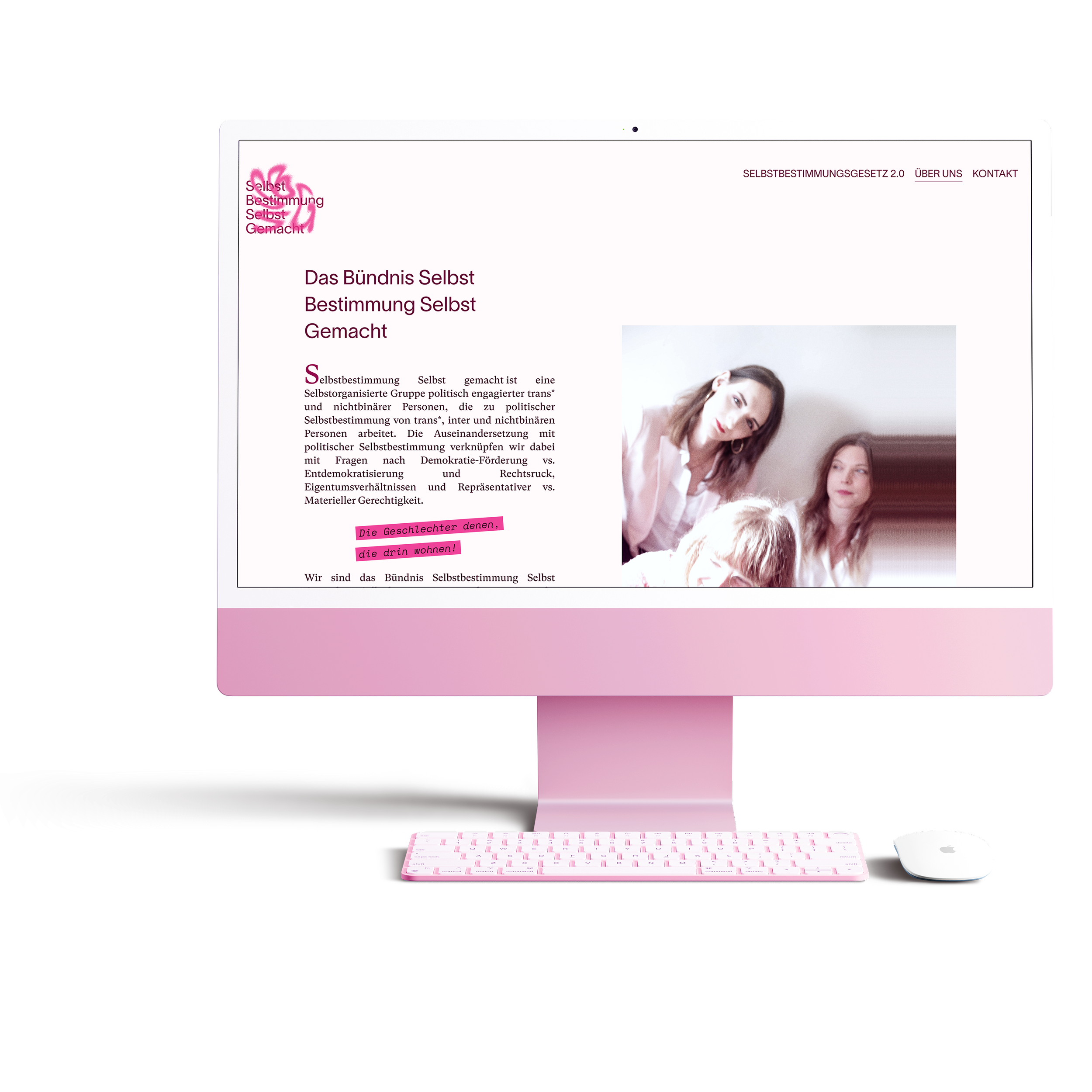
Website design
For the website design, I aligned the content with several team members. I proposed two site maps, for before and after the conference, in order to make the best use of our developer budget. I collaborated closely with an amazing full-stack developer who was just as passionate as I was about accessibility and responsiveness. Together, we meticulously ensured that every element—from images to typography—scaled responsively across all devices. We paid special attention to making the site user-friendly for all audiences, focusing on accessibility to ensure it met the needs of diverse users. This dedication resulted in a seamless browsing experience, no matter the platform.

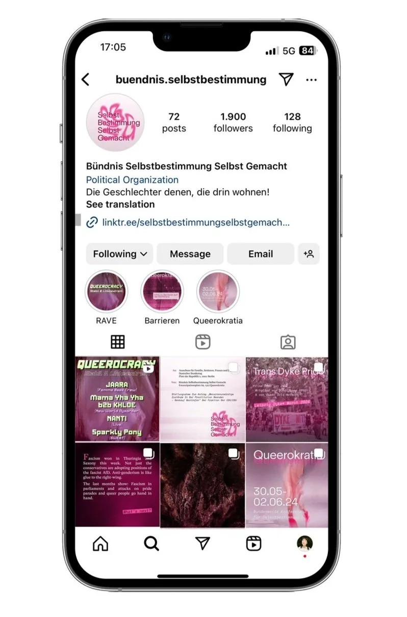
Social media
For SBSG’s social media, I focused on creating cohesive template styles using Figma to ensure a consistent and recognizable identity across their communications. I then trained their team on how to use these templates, guiding them through best practices for creating engaging posts independently. Alongside this, I designed a series of posts myself, especially for key events like the conference and the party, making sure they aligned with the group's tone and aesthetics while driving strong engagement.


Outcome
The rebranding led to significant achievements, including:
Successful Positioning: SBSG established a strong presence in both local and international activism circles, gaining recognition for its efforts.
Increased Online Engagement: The refreshed branding and social media strategy resulted in heightened online interaction and successful funding applications, driving support for the collective's initiatives.
High Attendee Satisfaction: Conference participants expressed high satisfaction due to the clear and accessible materials, enhancing their overall experience.
Expanded Outreach: SBSG successfully broadened its outreach to other political groups, fostering connections and support networks within the community.